
The half-second moments users never consciously notice — but always feel.
Introduction — What Are Micro-Interactions?
- Trigger :The event that starts the interaction (a click, a hover, a scroll, a form submission)
- Rule :what happens once the trigger fires (the logic behind the animation or response)
- Feedback :How the interaction evolves over time or with repeated use (does it behave differently the 2nd or 3rd time?)
- Loop/Mode :What happens over time or with repeated use (does the interaction change on the 2nd or 3rd interaction?)
Why It Impacts Conversions
Response time is the mechanism. Research on human-computer interaction has consistently shown that feedback under roughly 100 milliseconds feels instantaneous, while anything beyond a second or two starts to feel dead or broken. Micro-interactions close that gap before the user has time to wonder. Perceived speed rises even when actual load time is unchanged, and perceived speed correlates directly with completion.
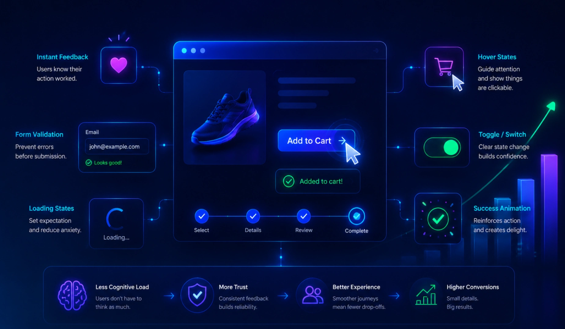
Micro-interactions also reduce cognitive load. Instead of reading instructions, users learn the interface by touching it. An inline validation message that appears the moment a password is too short prevents an entire failed submission cycle. A skeleton loader tells the user content is coming without a single word. Guidance embedded in motion is cheaper to process than guidance written in text, and cheaper for the brain means fewer abandoned flows at the exact moment where revenue is decided.
Trust compounds through repetition.
A single well-timed animation won't save a bad product, but dozens of small, consistent moments of feedback across a session build a subconscious sense that the product is reliable. Users don't consciously log every hover state or button response — but by the fifth or sixth interaction that behaves exactly as expected, a quiet trust forms. That trust is what makes someone comfortable entering a credit card number on checkout, or submitting a form with personal information.
The practical takeaway:
micro-interactions are the cheapest conversion-optimization lever available. They require no new traffic, no new copy, and no restructured funnel — only attention to the moments already happening on the page. A five-second fix to a hover state or a loading indicator can move numbers that a full redesign sometimes can't.
Quick Tip
Keep feedback animations between 150ms and 300ms. Faster feels glitchy, slower feels sluggish — and always respect prefers-reduced-motion.
Types of Micro-Interactions
Button Feedback
Instant visual response to clicks and taps that confirms an action was received in real time.
Form Validation
Real-time field checks that catch errors early, reducing frustration before users hit submit.
Loading States
Visual cues that reassure users something is happening, even during short backend delays.
Toggles
Smooth on/off transitions that make settings feel tactile, responsive, and easy to control.
Notifications
Timely alerts that surface important updates without interrupting the user's current flow or task.
Scroll Reveals
Content that fades or slides into view as users scroll, guiding attention naturally down the page.
| Type | Best Use Case | Conversion Impact |
|---|---|---|
| Button Feedback | Primary CTAs, checkout | High |
| Form Validation | Signups, lead-gen forms | Very High |
| Loading States | Dashboards, search results | Medium |
| Toggles | Pricing switches, settings | Medium |
| Notifications | Carts, messaging, alerts | High |
| Scroll Reveals | Landing pages, storytelling | Medium |
Note
More motion is not better motion. Animating everything competes for attention and slows perceived performance. Pick the three moments closest to revenue and polish those first.
Real-World Examples
Four projects where a detail measured in milliseconds moved a number measured in revenue.
Fintech onboarding
Inline validation plus a progress meter on a 4-step KYC flow cut abandonment sharply — users always knew what was wrong and how far was left.
DTC apparel store
An add-to-cart animation that flies the product thumbnail into the cart icon removed the "did that work?" moment entirely.
Analytics dashboard
Skeleton loaders replaced a blank spinner screen. Actual load time was identical; perceived wait dropped by roughly half.
Agency contact form
A success state with a checkmark draw animation and a clear next step replaced a plain redirect page.