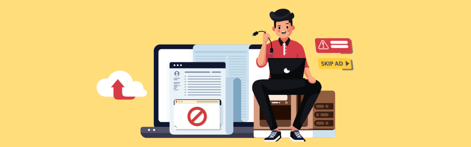
Almost all business entrepreneurs run their organizations with an aim to earn maximum profit accompanied by a desire to meet utmost satisfaction of their clients. Sometimes, acquiring both the aspects can be a tricky job if you are running a bricks and mortar shop. But, your dreams may turn out to be true when business is operating from an online platform. A well planned and designed website can yield maximum ROI and customer satisfaction but a poorly maintained website can ruin your all business expectations. So, it is important to consider certain essential aspects of web design in mind while creating your website.
The main success mantra behind every winning online business organization is customer-friendly website. Following are the certain mistakes to be avoided while building (developing) your eCommerce site.
At eMavens we have highly qualified and experienced Ecommerce Website Developers to meet all your Ecommerce store design and development needs.
Table of Contents
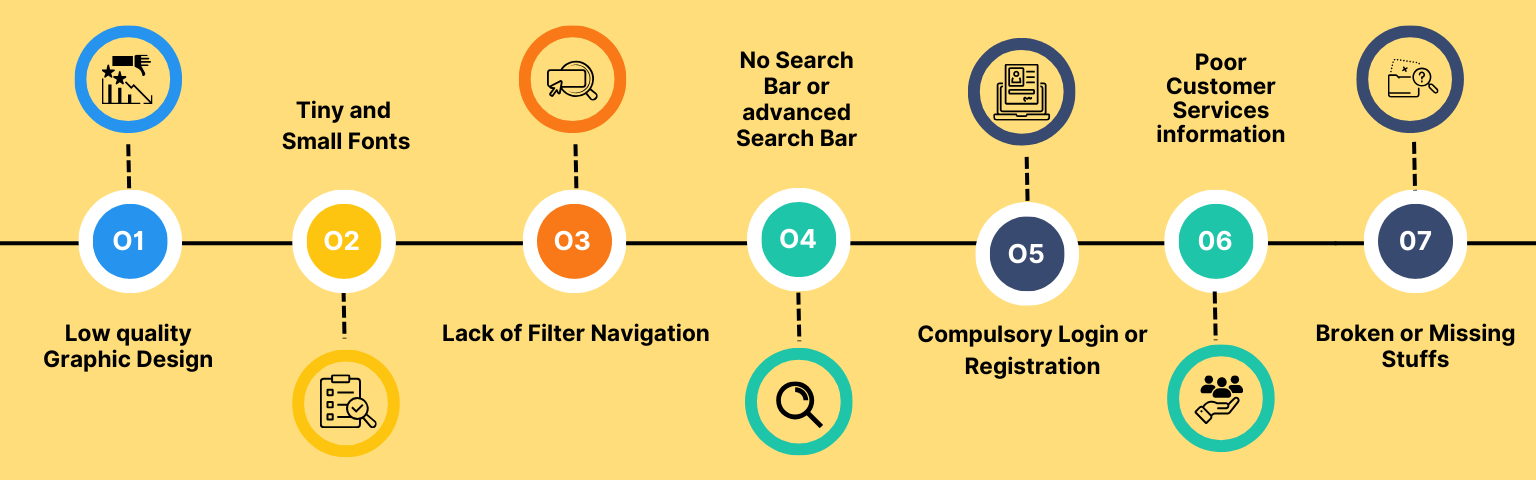
Low quality Graphic Design
Unappealing and unattractive designs of a website can diminish the rate of website visitors. The aesthetically designed and presented website can receive more visitors and their interest. As the website gets more visitors so thus their interest to purchase from the site.
Tiny and Small Fonts
Visitors find difficult to read content with small and tiny fonts in website. In mobile, these types of contents make difficulties to the potential visitors and they can read the information only when zooming is on. Computer users also find problem as they need to focus more to read the content. As a result, such things compel them to leave the site.
Lack of Filter Navigation
Filtered navigation is must have for an eCommerce site as it enables the buyers to search the product of their choice by filtering the product according to the price range, name of the company and products, etc, of their choice and interest. Choosing a product out of millions is a bit tedious job, but filtered navigation system can ease out the problem.
No Search Bar or advanced Search Bar
A search bar can confer a positive effect on the mind of the users. Visitors find the site more interesting as they are able to search for the product by typing on the search bar. It is useful as it enables the users to find the product easily even if when they don’t know about the product category.
Compulsory Login or Registration
In some of the ecommerce website, users have to login or register in order to made purchase products and services. This feature annoyed the users and they feel frustrated to login every time they visit the site. In order to make the site more appealing and user friendly, owner should avoid this feature or else integrate social networking login at the site for the same purpose.
Poor Customer Services information
Unavailability of contact number of customer care in each of the web page can lead to a negative perception of the users. Customers often want transparent information about the online merchant as they unveil their credit card information on the site to purchase and services offered by the site. So, it is important to mention their contact information and numbers in each of the webpage of the eCommerce site.
Broken or Missing Stuffs
Broken links, missing images on a website can lead to a bad user experience and negative perception. Generally, an eCommerce website requires plenty of resources including information on the products and services, images. Thereby, eCommerce websites boast of many links. Users get frustrated if they come across to broken links and missing images so often on a site. In order to offer good user experience, online merchants need to work vigilantly to avoid mistakes.
📓 To avoid common mistakes in eCommerce website development:
Focus on quality graphic design.
Use readable fonts, especially for mobile.
Add filtered navigation for easy search.
Include a search bar for product discovery.
Skip compulsory login.
Offer detailed customer service info.
Check for broken links regularly.
Conclusion:
Taking everything into account, the outcome of a web-based business depends on the client experience given by its site. Keeping away from normal entanglements like bad quality visual depiction, hard to-understand text styles, and absence of route choices is significant. Carrying out highlights like sifted route, search bars, and simple admittance to client assistance data upgrades client fulfillment and empowers commitment. By tending to these perspectives and guaranteeing a consistent perusing experience, organizations can construct trust, draw in clients, and boost their web-based potential, at last prompting expanded deals and benefit.